5 min read
Designing at Architectural Scale: Inside the BMO Centre Digital Signage System
Editorial design is more than big headlines and nice grids, it’s pacing, hierarchy, and repeatable structure. We break down the principles that make magazine layouts work and translate them into web modules you can reuse across pages.
Category:
Digital Layout
Updated:
Aug 24, 2026
Iryna
Brand Designer
Designing at Architectural Scale: Inside the BMO Centre Digital Signage System
Case Study
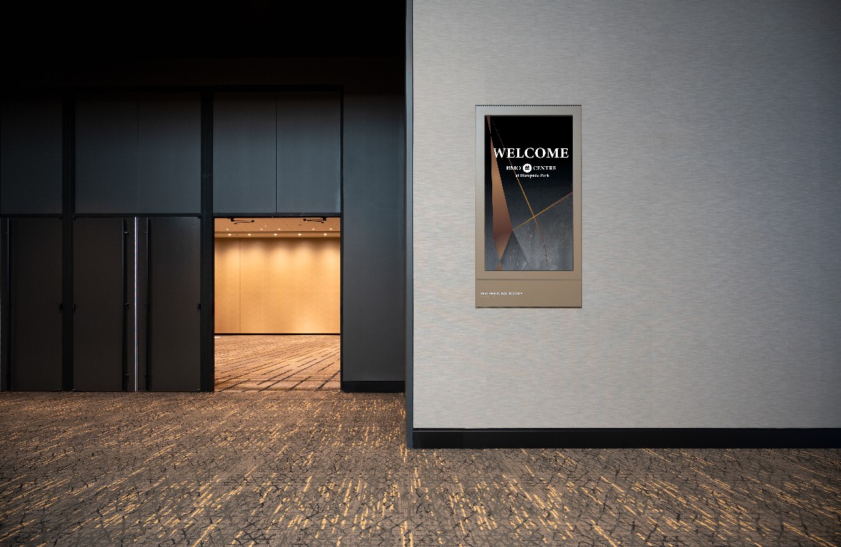
This is one of the largest projects I've worked on to date — a full digital wayfinding and signage system for the BMO Centre, spanning dozens of screens across a venue built to host major events, conferences, and exhibitions. The brief wasn't just "design some screens." It was to make digital signage feel like it belonged to the architecture, not like technology bolted onto it after the fact.
Starting from architecture, not from a template
Most signage systems start with a grid and a font. This one started with a fireplace. The BMO Centre has a custom architectural fireplace at its core, and early in the process, that became the anchor for the entire visual language — its materials, its finishes, its sense of restraint. The question we kept coming back to was simple: what would this space's own materials look like translated into pixels? That decision shaped everything downstream — warm metallic gold and copper tones, subtle gradients that echoed the fireplace's material richness, and clean geometry that stayed timeless rather than trendy.
Where marketing and tech had to agree
A project at this scale doesn't succeed on visual design alone. I worked closely with both the marketing team and the technical/AV team throughout — two groups with genuinely different priorities that had to land on the same page. Marketing needed every screen to reinforce brand prestige and organizational excellence, consistently, across a building with dozens of different sightlines and traffic patterns. Tech needed layouts that actually performed: legible at a glance from twenty feet away, stable across varying screen sizes and resolutions, and simple enough to update without breaking the system. My job sat between the two — translating brand intent into specs the AV team could build against, and translating technical constraints back into design decisions that still felt premium rather than compromised.
Restraint as the real design move
Leadership was clear from the start: nothing decorative. The system needed to read as modern and confident, not busy. That meant strong hierarchy, deliberate use of negative space, and motion accents used sparingly enough that they never competed with the wayfinding information itself. In a high-traffic venue, clarity isn't a nice-to-have — it's the whole point.
The result
What shipped is a system that visually echoes the fireplace at its center while working as hard-functioning wayfinding across the entire building — screens that feel like part of the architecture rather than an add-on, and a brand presence that reads the same whether someone glances at a directory or watches a full motion sequence. It's the project that taught me the most about what it actually takes to align creative vision with technical reality at scale — and why that alignment, done right, is invisible to the people walking through the space.

